
Your landing page has many jobs. Capture your visitor’s attention, clearly communicate value, outline features and benefits, build trust, and answer questions.
And ultimately, convince visitors to try out your product. Your landing page is your online salesperson working 24/7.
No matter how many ads, videos, emails, or funnels you create… your landing page is the final step.
Mess it up, and your potential customers are lost. You’ve got to get it right.
In this article, we dive deep into the landing pages of some of the most successful SaaS products. You’ll learn from the best with home pages from:
Loom
Workable
Wave
ClickFunnels
Omnisend
We will pull their pages apart and look at the design, structure, and, most importantly, copy. Because good design without good copy is like bread without butter, it simply doesn’t work well.
Finally, we’ll reverse-engineer the perfect SaaS landing page blueprint to convert your visitors into customers.
Let’s get it started!
Visually interesting, but at what cost?
The SaaS industry is known to invest a lot in high-quality design. And usually, this leads to a lot of visual interest. However, if your goal is conversions, visual interest cannot come at the cost of clarity.
The companies we picked managed to balance this and nailed the rest design principles of high-converting landing pages.
Also, they don’t try to convert visitors into demo calls where the sales team closes a sale.
This means they rely solely on their websites to do the selling. If these landing pages were to suddenly stop converting, their companies could quickly go under.
They can’t afford to mess these pages up.
The products we are looking at are:
Loom — video recording software
Workable — recruiting software
Wave — money management software for small businesses
ClickFunnels — marketing funnel building software
Omnisend — email marketing, SMS, and automation software for e-commerce
If that list of names doesn’t ring a bell, then let me assure you:
These are either unicorns or soon-to-be unicorns that can afford to invest in the best talent of designers, marketers, and copywriters. Their websites are no doubt the result of months of analysis, research, and experimentation.
You may not have the budget of these companies, but that doesn’t mean you can’t learn valuable lessons from their high-converting home pages.
Now let’s start pulling apart some home pages.
Depending on when you’re reading this, these companies may have already redesigned their websites. SaaS companies love redesigns. And sometimes, it’s for the right reasons; other times, it’s just to keep up with the current design trends. If you’re interested in how these pages looked at the time of writing, then you can use Wayback Machine (you can find the article’s publish date at the top).
Loom
Loom’s home page is short and straightforward, with only essentials to convert visitors into customers. Let’s keep in mind that Loom has a free basic plan, so when you offer something for free and have a simple product, you don’t need to do a lot of convincing.
Here’s a birds-eye view of their home page:
Why this page works
What makes Loom different from other similar tools in this category is positioning. Instead of being generic software to record all kinds of videos, Loom positions itself as a tool to cut down on meetings.
This sets them apart from competitors and reaches a more willing-to-spend money segment — freelancers and businesses working remotely.
Brilliant positioning!
As for design…
I can sum up the design feel in two words — graceful simplicity.
It’s clean and professional but also friendly and inviting.
As a legendary designer Dieter Rams said:
Good design is as little design as possible.
This certainly applies to the Loom home page. Dieter would be proud.
And most importantly, it works well with the product and the target audience.
Let’s look at how this plays out in their hero section.
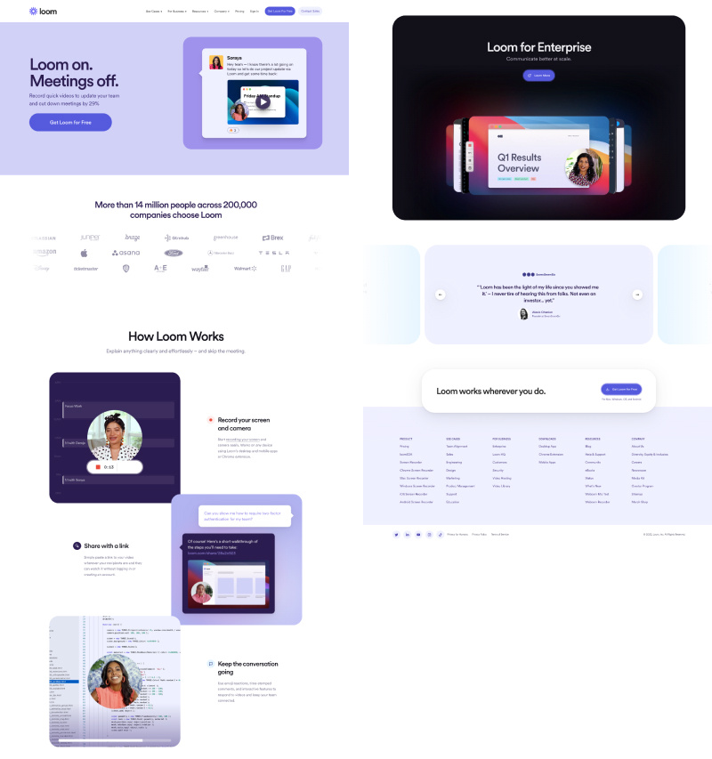
The synergy between copy and visuals
Loom uses the most common hero layout — split with text on the left and an image/illustration on the right. Users are so used to this layout that you can’t go wrong with this choice.
Powerful headline catching attention and hinting at the value proposition of Loom. The subheadline clearly states what Loom does and is very specific about the outcome:
“…cut down meetings by 29%”.
Crystal clear messaging. I love it!
The image on the right supports the copy and reaffirms the massaging.
The choice of image on the right is as brilliant as the copy. It’s Loom’s use case in action. But it’s more than that.
It’s a team member being proactive and adding value to a team. Essentially saying, “Hey, I know you’re all busy, so let’s skip the unnecessary meeting. I already recorded the project update. Here is the video”. The team responds with some fire emojis under the post.
Every little detail matters.
And it creates a coherent message: “With Loom, it’s fewer meetings, saved time, and happier colleagues.”
Finally, a CTA button: “Get Loom for Free”.
The key word here is not “Free.” It’s “Get.”
Get is a low-friction word. Let me explain…
Low-friction words let us achieve gratification passively or make work feel less like work. It’s words like: get, try, and reveal.
High friction words suggest you have to give up something, whether time, money, or energy. It’s words like: buy, sign up, and submit.
To increase conversions, use low-friction words in the call-to-action copy.
Sections that show authority and build trust
Here Loom displays a logo cloud with a subtle animation that catches an eye when scrolling and adds a premium feel.
Look at those names: Disney, Netflix, Amazon, Tesla, Apple…
My point is any company that associates itself with recognizable brands gains authority in the eyes of its prospects.
And this is key because you can’t have customers without trust, and you won’t be able to build any trust with your audience if they don’t view you as an authority.
Here are some other ways you can show authority:
Case studies
Testimonials
Stats
Share the founder’s expertise in the field
Other types of brand associations, like mentions in the media
Rating, badges, and awards from G2, Capterra, or other 3rd party review sites
In short, think about how you can demonstrate competency in solving users’ problems.
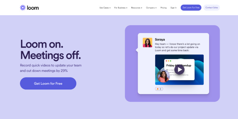
Right before the CTA, there is also a testimonials section.
If you read the first testimonial, you’ll notice this isn’t a generic “this is a great product” type of testimonial. Loom is creating brand evangelists.
The power of a great product + rock-solid positioning creates brand evangelists.
Explaining the product in a way a child would understand
In this section, Loom outlines 3 steps for customers to take using Loom product to solve their problem.
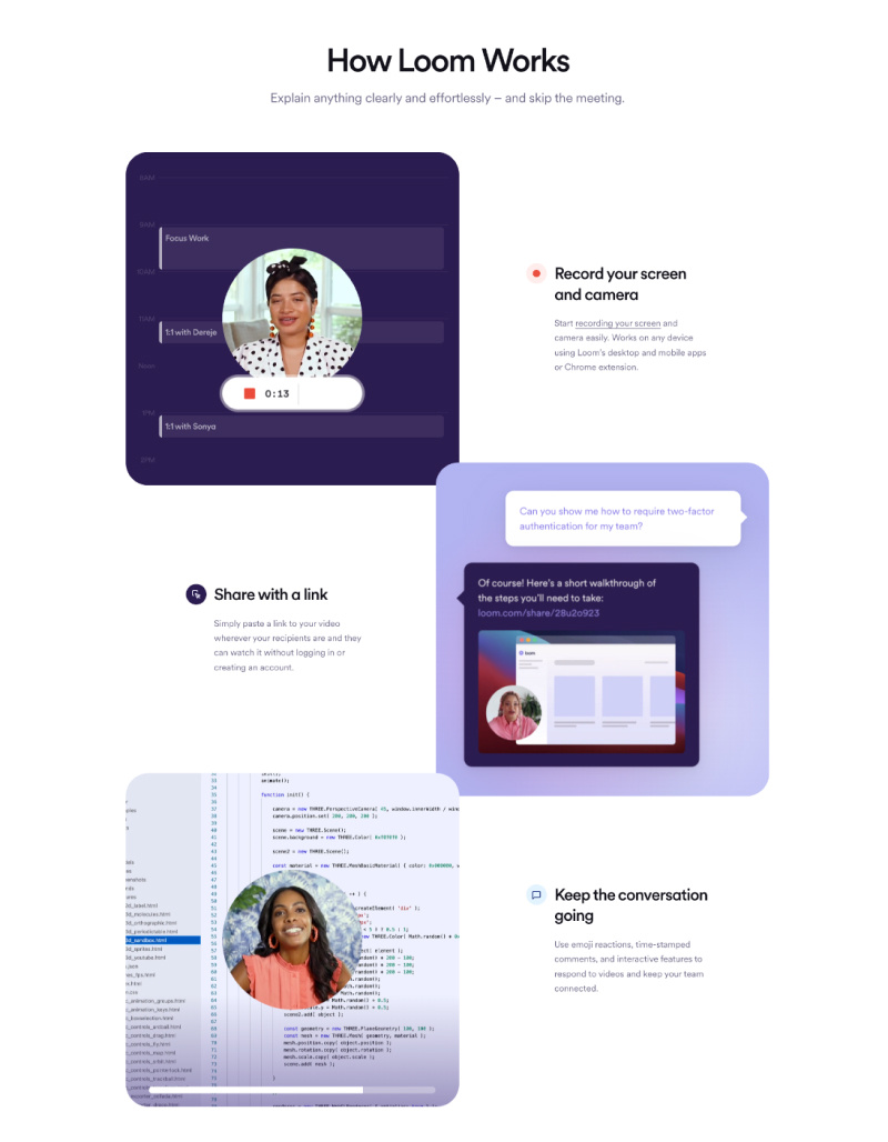
Even if I skim the page, which is what most people do, I can still get the plan just from reading the headings.
Record your screen and camera
Share with a link
Keep the conversation going
The plan sounds like explaining a product to a child. Seems too obvious and unnecessary, right?
It’s very necessary.
You can’t make your website and copy too clear or too simple. Most websites have the opposite problem.
Here is the truth…
People don’t tend to buy the best products and services — they buy the products and services that are easiest to understand.
Key takeaways from Loom home page:
First, focus on nailing your positioning. None of the marketing tactics work without solid positioning as a starting point. Great positioning is an input for writing compelling copy and designing a website that converts visitors into brand evangelists.
Include the 3-step plan. Think about what steps your customers need to take using your product to reach their ultimate goal, their future dream state. Make it as simple as possible.
Do less but better. You can design a visually interesting website by nailing essentials like a great color palette and typography, solid hierarchy, and high-quality visuals that support copy.
Workable
Workable is recruiting software that’s been in business for 10 years. We’ll definitely find some things on their website that we can learn from.
Let’s dive in.
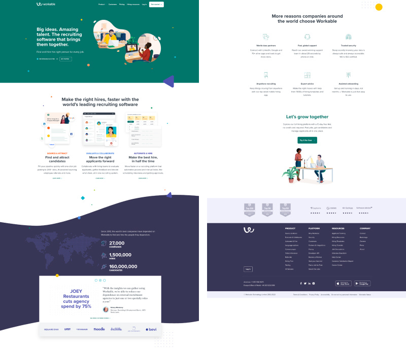
Why this page works
Like Loom, the Workable home page is short but long enough to convert visitors into customers. It’s packed with authority and has a powerful 3-step process.
I love how the designer added visual interest to the page by sprinkling it with colorful shapes. Workable color palette, illustrations, rounded borders, and shapes create a warm and friendly feel.
Let’s take a look.
The real reason people buy products
A familiar hero layout with split copy and an illustration on the right. The illustration is on point, with product use in action.
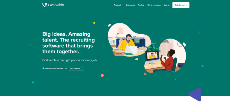
The headline tells what Workable is. Saying what it is (and who it is for) is one of the 3 simple methods to write powerful yet not salesy headlines.
But the subheading copy is where the magic happens: “Find and hire the right person for every job.”
Workable identified an internal problem that their customers struggle with and looking to solve. Finding the right person. Not just making a hire.
And this is a game changer. Let me explain…
Most companies try to sell solutions to external problems, but people buy solutions to internal problems.
Masterful hero section that definitely gets the attention of their target audience.
Let’s keep going.
Steps to the desired outcome
After Workable has visitors hooked, they follow up with a simple 3-step plan.
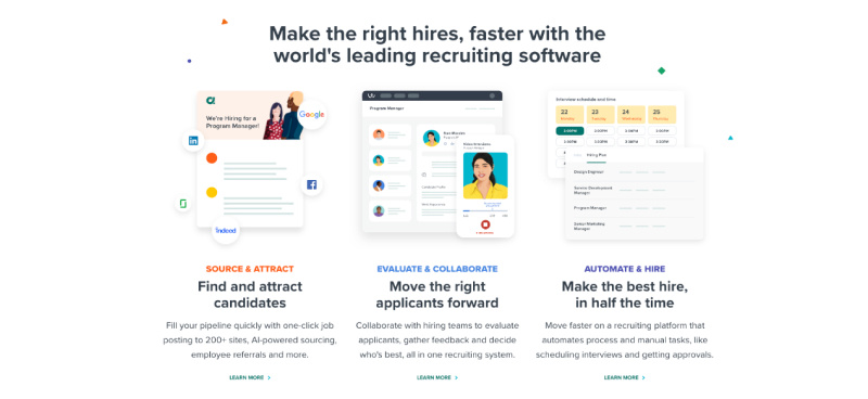
I love the typography here. See how above the title, there is also a tagline. This adds visual interest and tells what feature is behind a title that states the outcome.
And the final outcome is:
“Make the best hire, in half the time”.
This is what anyone wants who is looking to hire: get the best person and save time.
The most visually interesting section
Workable has placed company stats, testimonials with measurable client results, and logos of big-name clients into one tall section that gushes with authority.
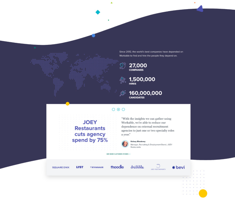
Of course, not everyone has been in business for 10+ years and has impressive results like this to display. But it’s a great example of how to make an authority section the most visually interesting on the page.
Translating features into value
Before the call to action, Workable displays a grid of benefits and how they translate into value.
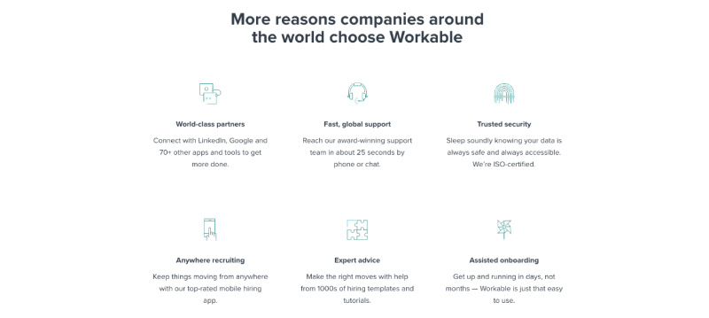
Why does this matter?
Features are only a starting point, but customers care about what those features can do for them. Features enable benefits, which can be translated into what customers value.
For example:
Feature — 15-megapixel camera.
Benefit — Sharp photo images.
Value — Images can be zoomed in or printed in large format and still look sharp.
Or, in a Workable example:
Benefit — Fast, global support.
Value — Reach our award-winning support team in about 25 seconds by phone or chat.
Now, there is one last section we need to cover…
Alleviating fears before the call to action
Take a look at the extra copy below the CTA heading: “… a 15-day free trial, no credit card required.”
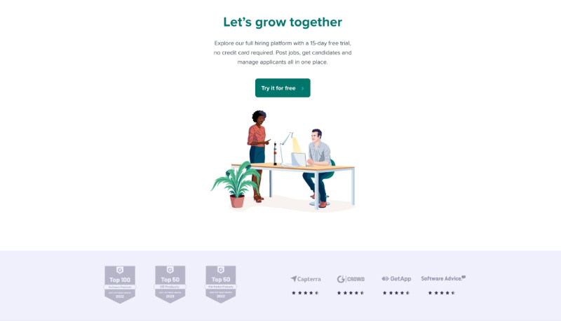
Why is this important?
Most SaaS companies require a credit card to sign up for a free trial, so they can bill you automatically after the trial ends.
But here’s the thing…
Nobody likes that. It creates a headache to not forget to cancel the trial if the product doesn’t work out for you. Or else your card will get charged, and it will cause frustration.
So this final copy alleviates an internal fear for your customers.
Also, look at the bottom of the CTA section. There is some more authority with G2 badges and ratings from various review sites.
I like how Workable kept the hierarchy intact by muting the too-overpowering orange color of G2 badges and other logos.
This makes a big difference because the CTA button is the priority here, so you don’t want anything else competing for attention.
Key takeaways from Workable home page:
Write benefits and value. Ultimately, what customers care about is the value of your features. What works well in design is a grid of 6 columns where a title is a benefit and a paragraph below states how it translates into value.
Don’t make the authority section an afterthought. Instead of resorting to a carousel of testimonials, try to think of other, more creative ways to display authority. Even if it’s just a more visually interesting use of typography or layout of testimonials.
In your CTA, alleviate the fears of your customers. The best and most obvious is no credit card is required for a free trial. Also, state the free trial length, especially if it’s at least 14 days.
Wave
Wave is an accounting and invoicing software for small business owners. What’s interesting is that it’s free forever if you only use core features like invoicing and accounting. And that obviously helps with conversions.
But that’s not the only thing that differentiates Wave from competitors.
Why this page works
When browsing through Wave competitors’ websites, I was overwhelmed by their home pages.
If your product’s market category is a bit boring, like accounting, you have to work extra hard with your copy, design, and home page structure to ensure you don’t confuse or overwhelm your visitors.
The last thing you want to do is dump all your features and go in-depth about how powerful (translation: complicated) your accounting software is.
Also, you can’t afford to mess up your page hierarchy, where multiple elements compete for visitors’ attention.
But these are precisely the mistakes I saw Wave competitors make.
So when I landed on Wave’s page, it was a breath of fresh air.
The home page had everything you need to convert visitors into customers and nothing you don’t.
Let’s take a look.
Design that evokes the desired feelings
My first impression of Wave when I land is friendly and fun.
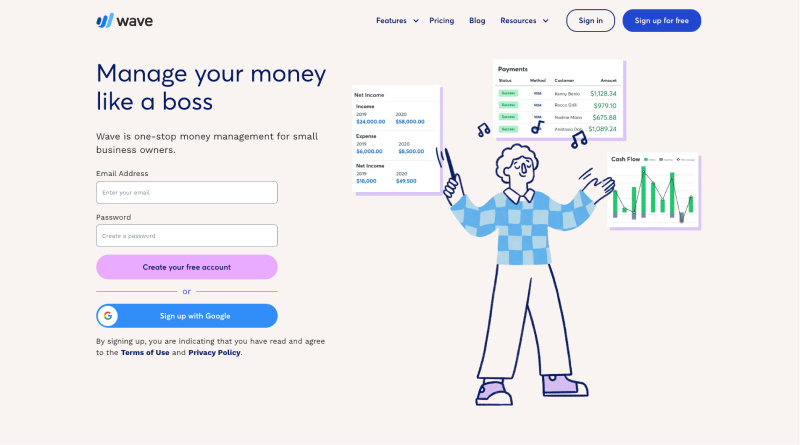
Accounting is the last thing I want to do. So when I see the headline: “Manage your money like a boss” and an illustration of a person who is smiling and looks chill, this puts me at ease because I think to myself: “maybe this will be the simple software I’m looking for.”
The subheading states what it is and who it is for: “Wave is one-stop money management for small business owners.”
The strategic design reinforces the copy that this isn’t the software for corporate accountants.
Another interesting element is a sign-up form right in the hero. This works well because it’s free, and the CTA button clearly states that.
Copy that connects on a deeper emotional level
Wave starts its value section with an explainer video. If you have the budget, it’s great because some people prefer watching a quick video, which helps with conversions. Plus, you can use it as a VSL in YouTube ads.
Let’s take a look at the copy.
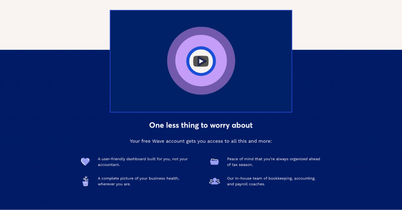
The heading promises to solve the internal problem: “One less thing to worry about.”
However, there is even a promise to solve a philosophical problem.
“…dashboard built for you, not your accountant.”
It hints that accounting software dashboards should be simple and easy to understand for everyone, not just for accountants.
Philosophical problem lives in a world of should and ought. The way things “should” be. The “right way.”
Remember I mentioned that people buy solutions to an internal problems?
A promise to solve a philosophical problem is a bonus that helps you connect with your visitors on a deeper level:
“Yeah, it should be built for me, not my accountant! “
Ideally, your website should promise to resolve all three levels of conflict in your customer’s life:
External
Internal
Philosophical
Design choices that prioritize conversions
The current trend in SaaS website design is a tabbed features section. I’m not a fan of it. Yes, it allows for more visually interesting layouts and transition animations but at what cost?
We know that users have no problem with scrolling, and we also know that sliders kill conversions. So why risk it and put your conversion rate on the line by requiring a click to reveal your features?
What Wave has done is they still have tabbed-like navigation that becomes sticky as you scroll. But instead of hiding sections in tabs, they remain visible as you scroll, and the navigation button scrolls the page to that section.
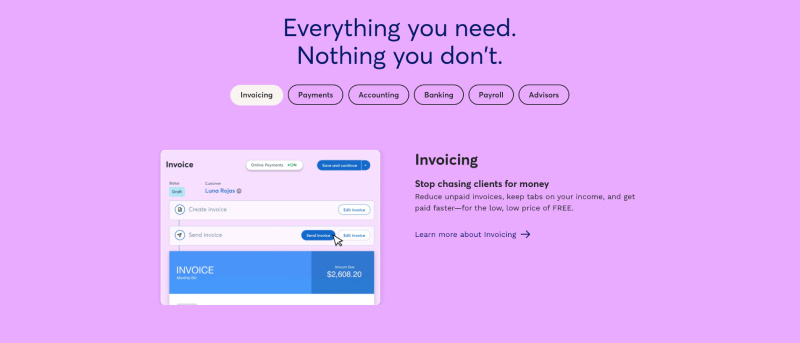
And I love the scrolling experience and the very generous use of whitespace. This is a way better experience and better for conversions than tabs.
Now let’s look at the heading: “Everything you need. Nothing you don’t.”
This is exactly the feeling I get when looking at the home page design. There are no gimmicks. Nothing that shouldn’t be there. But enough to convert visitors into customers.
A different way to display pricing
Usually, SaaS websites show a few pricing tiers with a features list inside each. That works fine for a Pricing page, but I don’t think it is a good idea to include it on your home page. Unless it is simple and you have a reason to show off your pricing, like a free tier.
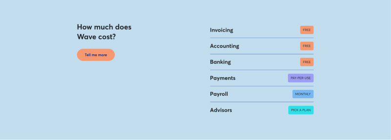
It works for Wave because they include a basic table indicating how their core features are priced. And you can see that the main features are free.
Dispelling doubts to increase conversions
The frequently asked questions section is a great way to overcome objections for visitors still on the fence. Especially for more complex software, visitors want to quickly find answers if your product has the capabilities they’re looking for.
Note that the FAQ section doesn’t necessarily have to contain the actual FAQs. If you still don’t have enough data from support tickets, you can anticipate visitors’ concerns and clear the air. For example…
In Wave’s FAQ, the first question is:
“Is your software actually free?”.
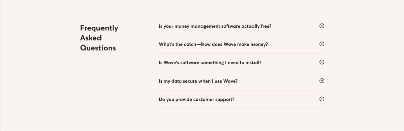
I wonder if this is the question that the support actually gets a lot. It looks like Wave uses the FAQ section to dispel prospects’ doubts and alleviate common fears about the product in this market category.
Now, there is one last section…
Messaging that resonates the best with target customers
Besides the final CTA, Wave has another one after the Features section.
If you have a longer page, it’s a good idea to have multiple CTAs.
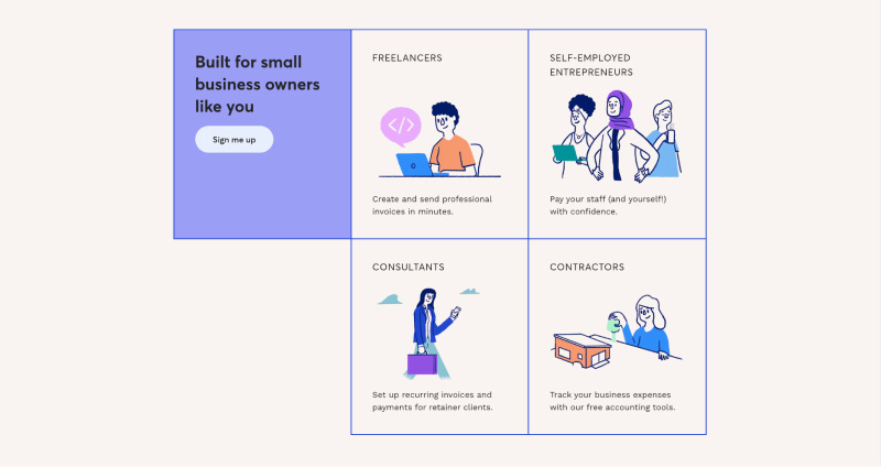
But what I like about this CTA is that Wave uses it to tell who it is for. Yes, they already mentioned it’s for small businesses, but that’s too broad.
Think about it.
If you’re a freelance web developer, what will resonate more with you:
Seeing just a copy: “…for small business owners”?
Or seeing a copy: “Built for small business owners like you” and an illustration of a person coding on his laptop with a “Freelancers” title at the top?
Key takeaways from Wave home page:
Avoid tabbed sections and carousels. There is no reason to risk that the hidden content will remain unseen. Designers who use them are either misled or don’t understand how to optimize the design for conversions.
Include the FAQ section. Be strategic about the questions you include. Use questions that dispel your prospect’s doubts and alleviate common fears about the product in your market category.
Include pricing section. If you have attractive pricing, like a forever free basic plan or at least much lower pricing than your competitors, then it makes sense to showcase it on the home page itself.
ClickFunnels
Who knows more about conversion rate optimization than the company that sells the software for building sales funnels?
ClickFunnels has a few things on its home page that we haven’t seen yet and can learn from.
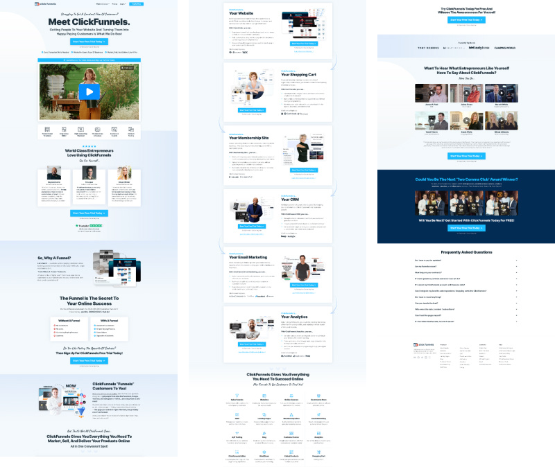
Why this page works
As we already covered during the Loom review, your positioning is the foundation. Once you nail your positioning, you’ll know what copy to write and what home page sections you need.
ClickFunnels positioning is the all-in-one toolkit for everyday people who know nothing about marketing and online business but want to start selling online. Their visitors are in the problem-aware stage of awareness.
They have no clue what a funnel is and think they just need a website.
Why does this matter?
First, ClickFunnels needs to educate its prospects and explain that the real solution to their problem is building a funnel. Once visitors are solution-aware, ClickFunnels presents their product as the best solution and makes the sale.
Drawing attention to the desired component
ClickFunnels uses beautiful typography with a mix of handwritten font and a big, bold heading. But what draws the most attention is the auto-playing video below.
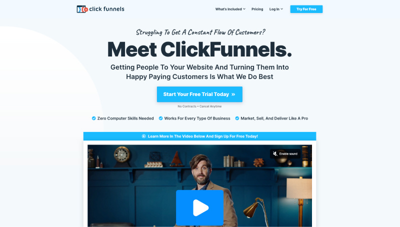
An auto-playing video generally would be annoying, but ClickFunnels knows what they’re doing. Moving the video to the top of the hierarchy makes visitors more likely to click on it. And I think ClickFunnels thinks they can engage with their audience through video better. And the video really is fun and engaging.
“Before - After” section that compels action
ClickFunnels aren’t actually selling software.
Let me explain…
Your customers want you to help them transform into someone better. And brands that participate in the character transformation of their customers create brand evangelists.
What ClickFunnels is actually selling is the transformation into “Online Success.”
The “before-after” section is a way to clearly communicate the transformation their customers will experience by using their product.
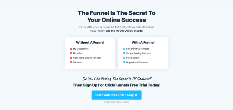
This is a persuasive section, and I wish more SaaS companies had this on their websites.
Or you could go even further and create a dedicated before & after page like Basecamp.
Testimonials that build a moat
There are multiple sections where Clickfunnels shows authority and builds trust, but I wanted to draw attention to the video testimonials section.
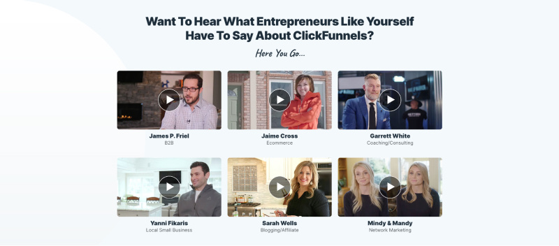
This is something I don’t see often. Most websites have ratings of G2, Capterra, etc., and some written testimonials.
However, that doesn’t even come close to the impact of video testimonials. Video builds trust like nothing else. Also, that’s an opportunity to stand out.
Yes, it requires so much more effort to produce video testimonials. But they are also so much more powerful than text.
And for those same reasons you’re hesitating, your competitors are likely not doing it either. So if you did it, it would become a moat for your business.
Key takeaways from ClickFunnels home page:
Make sure you correctly identify your visitors’ awareness. This will depend on your positioning and the market segment you’re targeting.
Use the “Before and after” section. This can be as simple as two columns side by side with a list. Another good way is to use illustrations. E.g., chaos before, order after. Think about what success and failure look like for your customer. Think about what you’re helping your customer avoid. What’s the cost of not using your product?
Consider using video testimonials. Having a customer give a testimonial in a video is much more powerful than a text. Also, it’s a moat for your business.
Omnisend
A company selling software in the marketing category surely knows how to build a high-converting home page.
You won’t find any gimmicks on the Omnisend website, just conversion rate-optimized design.
Let’s take a look.
Why this page works
In the email marketing category, the competition is brutal. To go head-to-head against the market leaders is suicide. So once again, the positioning is critical here.
Omnisend zeroed in on the market segment they could serve the best — e-commerce marketers.
From the design point of view, this page feels… fresh. Clean and simple. And there is enough visual interest, so it’s not boring.
Beautiful premium font and large, bold headings make the page easy to skim.
Let’s take a look at individual sections.
Basic human psychology to increase conversions
Omnisend leads with a headline that hints at a philosophical problem: “Increase sales, not your workload.”
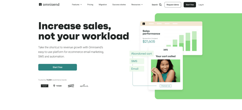
It’s similar to a common mantra in business: “You should work smarter, not harder.”
This resonates exceptionally well with Omnisend’s target audience — marketing professionals.
Who wouldn’t want to improve their company’s performance without adding to their workload?
The illustration on the right shows growing sales, the future success.
Also, notice a person with a genuine smile.
Believe it or not, pictures of happy smiling faces increase conversions.
Here is why…
When we see someone smile, our brain releases neurochemicals like dopamine, which makes us feel good. This is because smiling is a social cue that tells us that the person is happy and friendly. Also, it’s a sign of social confirmation and makes us feel like we’re a part of something.
The value that is backed up with evidence
During the Workable landing page review, we already covered that features are only a starting point.
Features enable benefits, which can be translated into what customers value.
Omnisend hits all three in this section and backs it up with some stats.
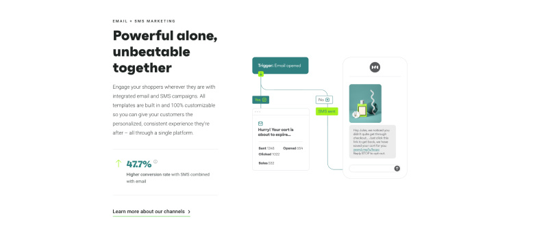
First, it starts with a tagline as a feature, then a benefit as a heading, and a paragraph to explain the value.
Omnisend backs their claims with evidence, ending the column with stats based on their annual report.
Remember, your value should be as fact-based as possible.
Just a brilliant design from Omnisend.
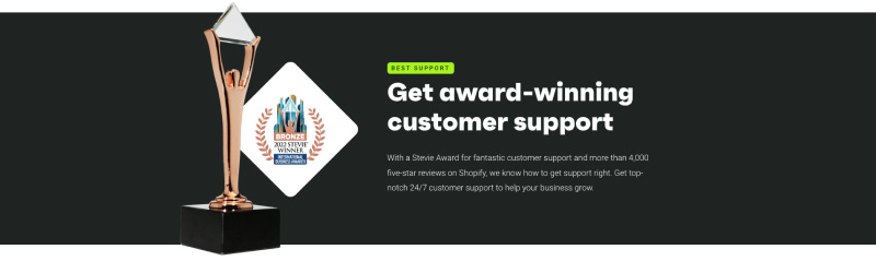
Providing the hard evidence
A lot of companies claim to have excellent support. But as I just mentioned, this claim needs to be as fact-based as possible. Or else it’s an empty claim.
Verifiable stats, high customer ratings, and testimonials are a few ways to do this.
But Omnisend did a slam dunk by showcasing an award for “fantastic customer support” that also looks like an oscar statuette.
Luring customers from competitors
Let’s imagine the scenario:
An e-commerce marketer is scrolling Omnisend’s home page. He is currently using a competitor’s more generic software.
He loves that Omnisend is built specifically for e-commerce. He is considering switching, but…
A change is hard…
Especially when you think about all the trouble migrating the data, configuration, etc.
This section alleviates the fears about the switch: “Easy migration, complete data sync…”
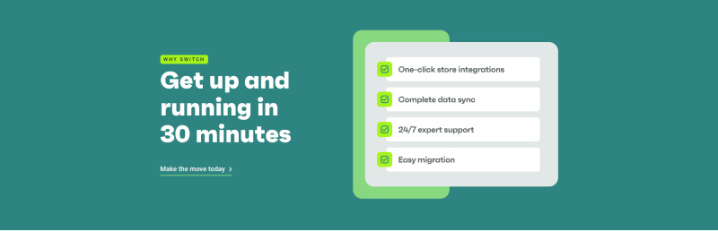
If you’re in the same boat, I think this is a great way to increase conversions.
But remember…
You need to know where your visitors are on the buyer’s awareness journey to pull this off. This requires a buyer that’s well aware of products in your category and is likely using a competitor’s software.
Key takeaways from Omnisend home page:
Back your value with facts as much as possible. This adds credibility because you’re not just making empty claims like most competitors.
Make sure your page is easy to skim. Your hierarchy has to be on point, so the headings can stand out. Also, I recommend investing in a premium font. It’s a subtle way to add a more premium feel to your design.
Consider the “Why switch” section. If your audience is well-informed and is likely already using a competitor’s software, then the section where you describe an easy process of switching will increase conversions.
The perfect landing page structure for your SaaS startup
After looking at these 5 landing pages, you can see patterns emerge. Despite different positioning and messaging, audiences, and market categories, they share some common sections.
We’ve assembled those sections into a blueprint for you to build or redesign your SaaS website.
For this blueprint, we assume that your visitor is in the problem-aware stage and needs a bit more persuasion, hence the longer page. However, it’s easy to trim down this blueprint for the solution-aware stage.
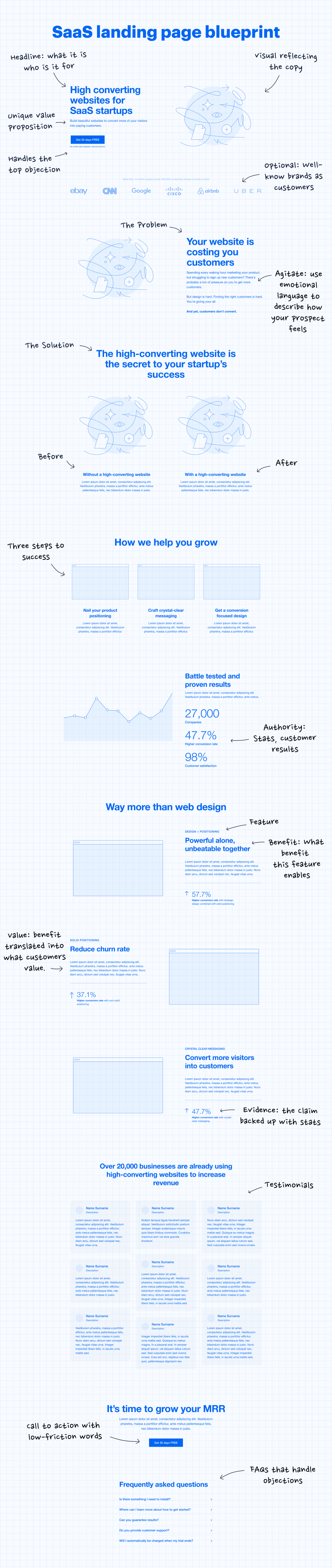
Conversion-focused design principles you should follow
I know you wish there was a proven landing page structure that you could always rely on.
But the reality is that such a SaaS landing page template doesn’t exist.
It depends on your product, positioning, and visitor’s stage of awareness.
However, there are five conversion-focused web design principles.
You should ask yourself:
Is there a clear hierarchy, or do multiple things compete for attention?
Is it clear, or is it confusing?
Interesting or boring?
Is the general feel of the website achieved? (inspiring, serious, friendly, playful, premium/exclusive, etc.)
Is it consistent? Does every image or illustration support the copy or take up space?
Now it’s your turn
Now, you have five solid examples for inspiration and the website blueprint. That should give you a jumpstart when designing your SaaS website.
