
Five conversion-focused design principles to capture visitors’ attention, keep them engaged, move down the page, build trust, and convert. Here are the five questions you need to answer when designing a landing page.
Effective design is effective messaging. And if your messaging resonates, more people will convert. Conversions are the effect. But design is the cause.
And even though design plays a major role in your website, how do you know whether it works?
You likely measure every imaginable metric on your site, but do you know how your design elements work?
The way to improve the design is to break it down into five principles, measure, and work on each separately:
Hierarchy. You got my attention.
Clarity. I get it.
Interest. I want to know more.
Feel. I want it.
Consistency. This looks credible.
When you focus on the five principles and apply them correctly, you can simplify the process of designing a website that is visually pleasing, easy to navigate, and effective at converting visitors into customers.
Introducing: Conversion-focused design principles
We’ve studied how marketing and copywriting interconnect with design. How to make them work in synergy.
And we’ve been paying attention to the components that make the design more effective.
These new principles are your go-to systematic way to design a website that works.
So, if you want to convert more customers with your design, here are the five principles it has to follow:
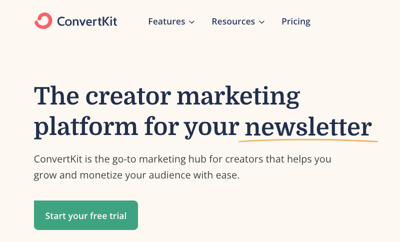
1. Hierarchy: What should I pay attention to?
Is it clear what visitors will see first, second, and third, or do multiple elements compete for attention?
Hierarchy is everything in web design. It's the key to making a website feel "designed".
Visual hierarchy refers to how important the elements on a website appear in relation to each other.
But, when everything on a page competes for attention, it feels noisy and chaotic, like one giant wall of text where it’s unclear what actually matters.
So how do you make sure your website has a good visual hierarchy?
It’s all about making deliberate decisions about spacing, layout, type scale, colors, and visuals. The sum of all these decisions creates the hierarchy.
Ask yourself what you want on the page to be seen first, second, third, etc. Then, deliberately de-emphasize secondary and tertiary information and make an effort to highlight the essential elements.
The better you provide visitors with a sense of visual hierarchy, the easier your content will be to perceive. The higher conversions.
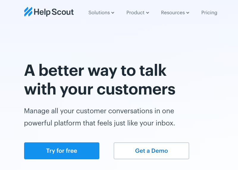
2. Clarity: What is it?
Is it easy to understand what your product does, or is it confusing and overwhelming?
If we confuse, we lose.
Confusing language and jargon will slow down users and require them to use too much brainpower.
If someone has to use too much brainpower on your website, they’re likely to bounce right off the page.
So, make sure your words are:
Concise
To the point
Easy to understand
Don’t try to sound smart. Be efficient.
Finally, ensure the overall experience of navigating the page is easy and cluttered. No need for over-the-top scroll animations. Keep it simple.
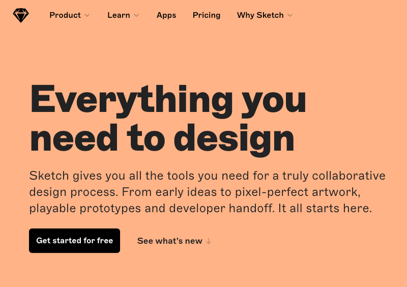
3. Interest: Should I keep scrolling?
Does the website capture and hold users’ attention, or is it dull and unengaging?
When designing a website focused on conversions, we must strive for visual interest without sacrificing clarity and conventions.
Many websites look similar, and that’s by design because users have grown accustomed to certain common patterns and layouts.
They expect to see certain things when they land on your website, like a split hero with some text and an image or illustration.
If you deviate too much from conventions, you risk breaking principle #2, clarity, and decreasing conversions.
Conventions don't mean your design has to be boring.
It’s the opposite. You need to have visual interest to increase engagement. The challenge is adding visual interest while using common web design patterns.
This is where great designers really shine. They can work within certain constraints and still create beautiful, exciting designs. They rely on the fundamentals to create visual interest, like typography, colors, spacing, and high-quality images/illustrations.
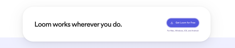
Take Loom. It’s a great example of achieving minimalist and elegant design using colors, spacing, typography, and good images/animations.
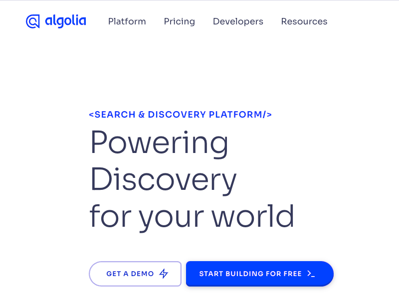
4. Feel: Is this for me?
Every design has its own personality. A company selling enterprise software might want to communicate security and professionalism, while a trendy startup might have a design that feels fun and playful.
Design feel combined with your messaging answers the big conversion-related question: “Is this for me?”
You need to make sure the design personality resonates with your audience. Because if it’s not, it’s game over.
Here are some examples of design personalities:
Warm and friendly
Secure and reliable
Premium and sophisticated
Bold and inspiring
Joyful and adventurous
Elegant and minimalist
While it might sound abstract, a design’s personality is determined by a few concrete factors.
How to create a feeling with design?
Font choice
Typography plays a huge role in determining how a design feels.
Use a serif typeface in your design for an elegant or classic look.
For a playful look, a rounded sans serif would work well.
A neutral sans serif works great if you’re going for a plain look or want to rely on other elements to provide the personality.
Also, the heavier font-weight creates a bold and confident look.
A thinner font creates a more elegant and sophisticated look.
Same thing with size. Bigger - bolder. Smaller - more elegant.
Colors
There’s a lot of science behind the psychology of color, but in practice, you just need to pay attention to how different colors make you feel.
Blue is safe and familiar, golden yellow on black might say “expensive” and “sophisticated”, and pink is a bit more fun and less serious.
Border radius
As small as it may sound, if and how much you round the corners in your design can greatly impact the overall feel.
A small border radius is neutral and doesn’t communicate much personality on its own.
A large border-radius starts to feel more playful.
While no border-radius at all feels a lot more serious or formal.
Copy
The text on a page has a massive influence on the overall personality.
Using a less personal tone might feel more official or professional, while using friendlier, everyday language makes a site feel friendlier.
Text is everywhere on a page, and choosing the right words is just as important as choosing the right color or typeface.
5. Consistency: Can I trust them?
Whatever design style and personality you choose, it’s important to stay consistent. Mixing square corners with rounded corners on the same page almost always looks worse than sticking with one or the other.
It's the little things that trigger doubt.
Small details distinguish between a high-quality, professional look and an amateur look.
Also, ensure your design’s personality matches your copy’s tone of voice. And that every image and illustration reflects and supports the copy around it.
Finally, it’s crucial to have a consistent, clear call to action throughout the page. It should be easy for the user to understand what they need to do next.
The principles are in order
Keep in mind all of these principles are listed in order. You can’t have clarity without first creating a good hierarchy. Interest doesn’t matter without clarity, and so on.
When you design your website or landing page, focus on one principle at a time to keep your design process clear.
By following these principles, designers can create websites that are easy to navigate, clearly communicate a product’s value, are engaging, build trust and ultimately lead to conversions.
Conclusion
Once you understand your shortcomings, you can follow the recommendation to improve your design and messaging to communicate effectively and, of course, profit.
